Welcome to

IngenioRx:
Designing Clarity
into Complex Care

A full redesign of the IngenioRx Specialty Pharmacy web and mobile experience, transforming a fragmented, hard-to-navigate interface into a clear, cohesive digital product built around the needs of members managing complex and chronic conditions.
Team Structure:

Product and business - USA (Anthem)
Design team - UK
Development team - India

My Role:

Senior UI/UX Designer
IngenioRx interface redesign
Product Redesign · 2020–2021
Scroll
Overview
Challenge /
Approach
01

Context

IngenioRx Specialty Pharmacy, a division of Anthem (now Elevance Health), serves members managing complex or chronic conditions requiring specialty medications. In 2020, the organization sought to modernize its digital ecosystem, encompassing a desktop web portal and a companion mobile app, to better support members, care teams, and partners. As the Senior UI/UX Designer on the project, my mandate was to deliver a fresh, intuitive, and visually cohesive experience aligned with IngenioRx's brand identity and optimized for usability across devices.

02

Challenge

The client and DPMs came in with four concrete problems. The UI was visually flat, with sections indistinguishable from one another and no clear hierarchy to guide the eye. Analytics showed a steep engagement drop below the initial viewport, meaning entire feature areas went unused simply because members never scrolled far enough to see them. Information that should have been immediately visible was buried behind additional links and required several steps of navigation to reach. And beyond fixing what was broken, the team had a forward-looking ambition: to introduce upcoming features in a way that felt like a natural part of the experience, not an afterthought. Together, this pointed to a product that needed structural rethinking, not just a visual refresh.

03

Approach

Rather than treating this as a cosmetic update, the redesign was approached as a systemic problem. The solution centered on three interconnected design challenges: establishing a functional visual language that could carry meaning at a glance, restructuring the dashboard for density and readability, and ensuring a seamless, consistent experience across both desktop and mobile. The work was delivered across a globally distributed team: stakeholders in the US, design collaboration in the UK, and a development team in India.

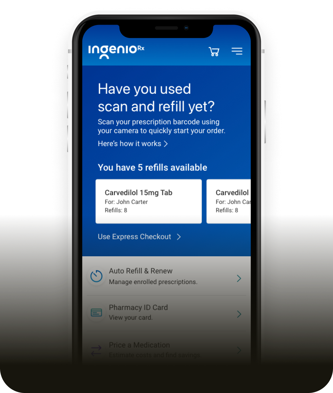
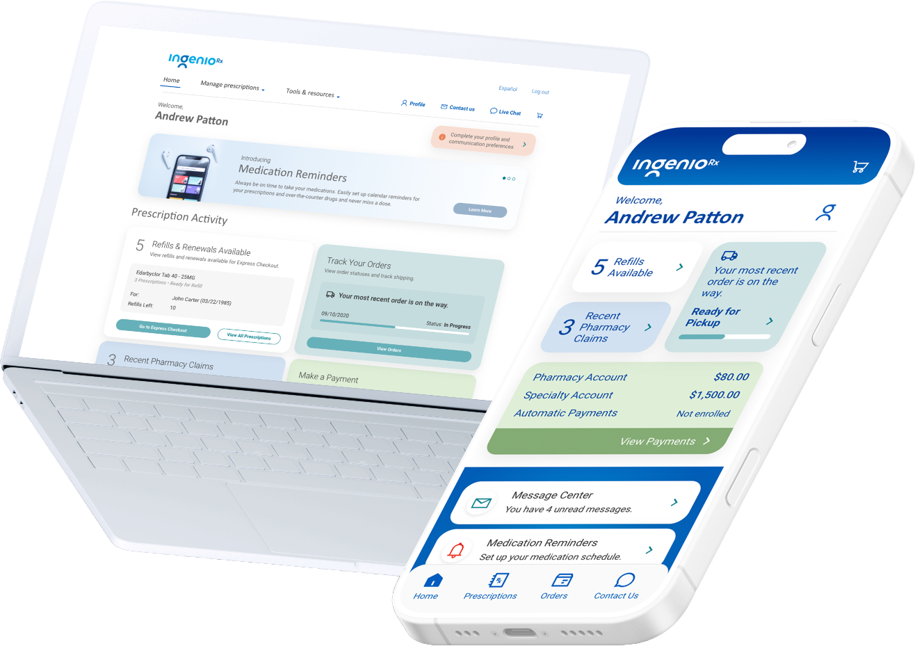
IngenioRx interface overview IngenioRx mobile view
Identity
A Color
System that
Communicates

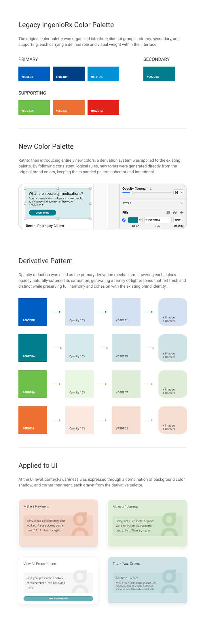
The color system was redesigned to carry functional meaning throughout the interface. Each hue in the palette was assigned a specific semantic role (status, urgency, category), creating a visual language that communicates at a glance. The result reduces the need for explanatory copy and allows users to scan complex medication and claims information quickly and confidently across every screen.

IngenioRx color palette
Experience
An Interface
Built Around
Information

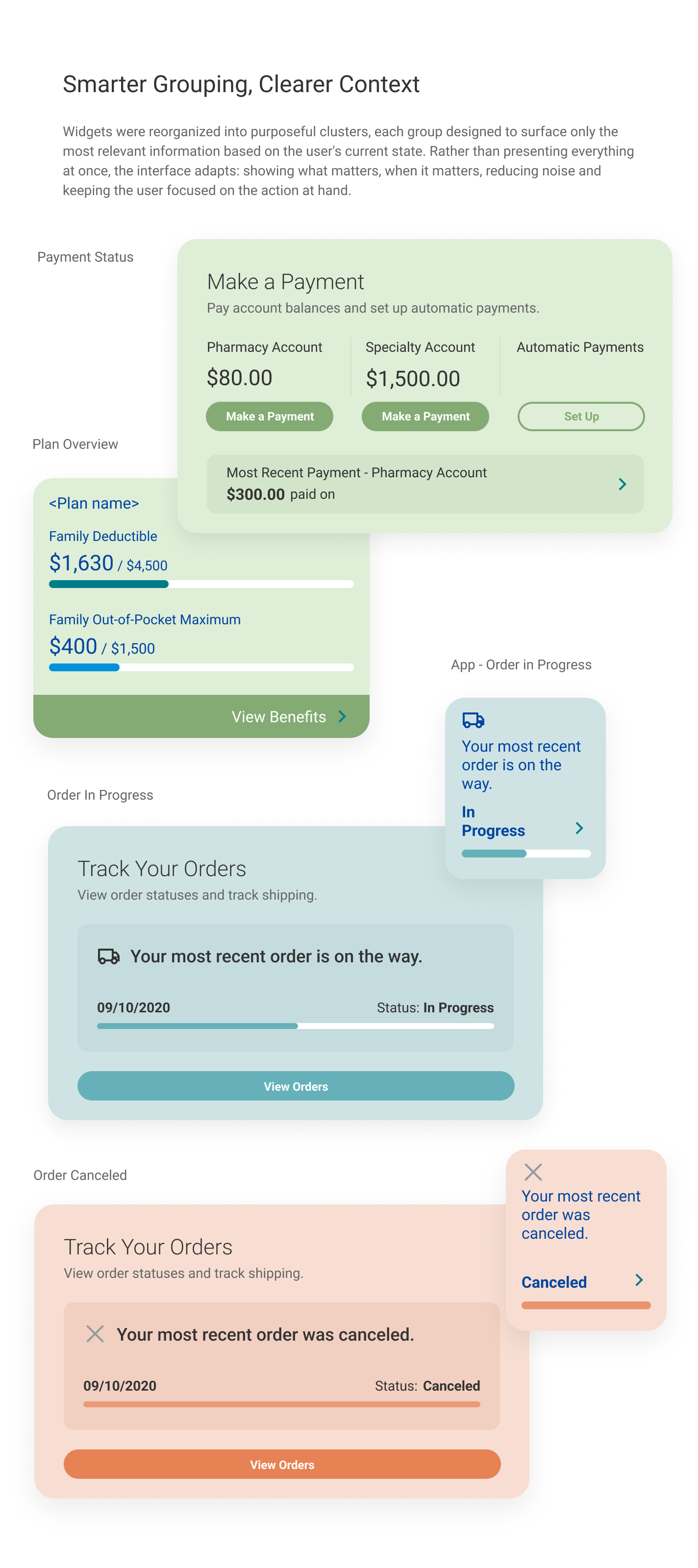
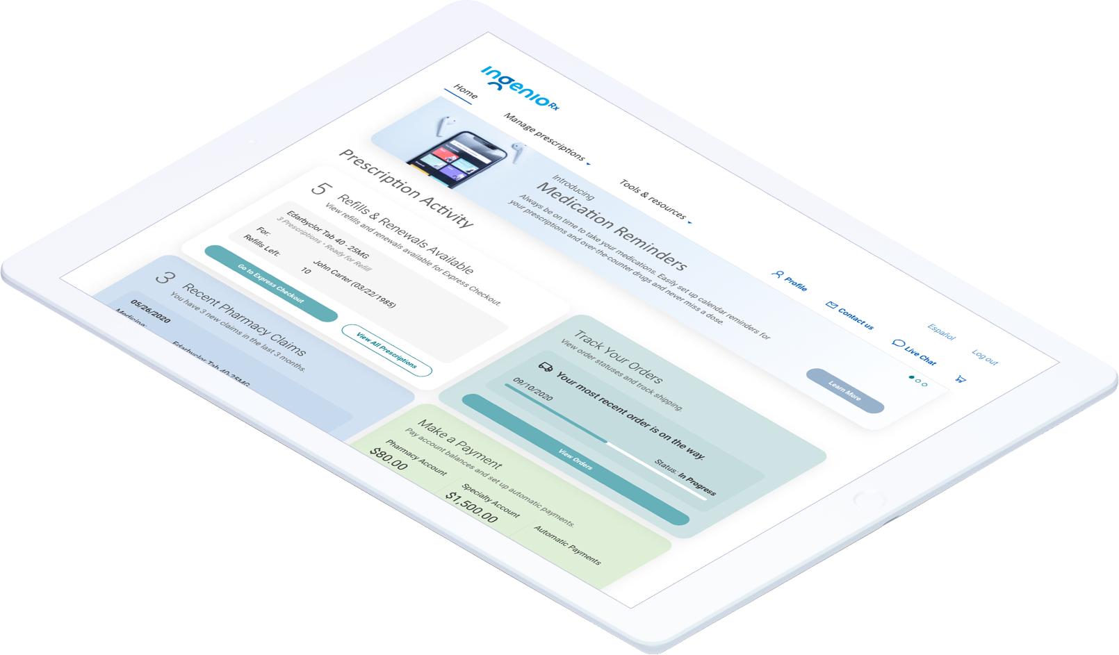
The dashboard redesign focused on density and immediate readability. By reorganizing content into compact, meaningful clusters, the redesigned layout displayed twice as much information in half the vertical space, allowing users to grasp the status of their orders, payments, and claims at a glance. The interface was designed around clear information hierarchy, with context-aware states surfacing the most relevant content depending on the user's situation. Special attention was given to contrast ratios, font scalability, and touch-target sizing, ensuring compliance with WCAG accessibility standards and inclusive usability across the full member base.

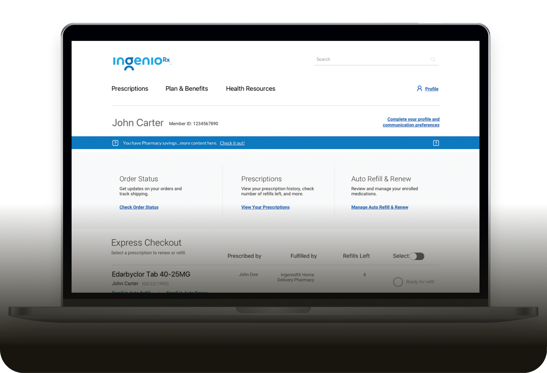
IngenioRx dashboard redesign

Customer Landing Page -Desktop part 1

Customer Landing Page -Desktop part 2

Customer Landing Page -Tablet

Customer Landing Page -Tablet

Customer Landing Page -Mobile

Consistency
One Experience
Across
Every Device

The redesign aligned the desktop web experience and mobile app around a shared design system, ensuring consistent iconography, component behavior, and color semantics across platforms. This created a seamless transition for users moving between devices and strengthened brand coherence across the entire digital ecosystem.

Retrospective
Summary /
Reflections
Impact

What the Redesign Delivered

The redesign shipped to production in January 2021 and remained the live experience until January 2023, when IngenioRx was rebranded to CarelonRx. Across that two-year period, the redesigned dashboard saw measurably increased engagement with features that had previously gone unused, a direct result of moving critical information above the fold and reducing the navigation depth required to reach it. The new design system provided a scalable, cross-platform foundation that supported the product through its full lifecycle and into the rebrand.

Learning

What This Project Taught Me

Redesigning a healthcare-oriented digital product during a period of accelerated digital transformation reinforced how much clarity and empathy matter in UX. Strategic use of color and hierarchy can dramatically improve scannability and engagement, even within the constraints of an established brand system. Cross-functional alignment between design and engineering must be continuous, not sequential. And remote collaboration, when structured around prototypes and shared visual references, can be just as effective as in-person design sprints.

Takeaway

Trust Through Clarity

IngenioRx was a reminder that the most impactful design decisions are often invisible to the user. When hierarchy, color, and layout work together seamlessly, the experience simply feels right. For members navigating the complexity of specialty medication management, that feeling of clarity and confidence is not a nice-to-have: it is the product.

← Back to home Back to top
Got an idea?
Get in
touch.

If you're building a product, exploring a new direction, or looking for a senior designer to help shape strategy and execution, reach out.